Name:
Pros - Related to Cedar Rapids (quite literally the rapids), alliterative, NOT euro-wannabe
Cons - Lacking originality (been done before), not a unique enough feature of the town.
Grade - We like the reference to the rampaging rapids that often are seen in a swelling Cedar River. Interestingly, it verges on the common theme in American soccer naming one's club after the natural disaster that devastated the home city (Chicago Fire based on the 1871 fire, San Jose Earthquakes on the quake of 1912, and now this which makes one think of the rampaging waters of the Flood of '08). For me, it also rings eerily similar to the Grand Rapids Rampage, a former Arena Football League team just down the road from where I lived as a teen (they used a rampaging Rhino in their crest). B-
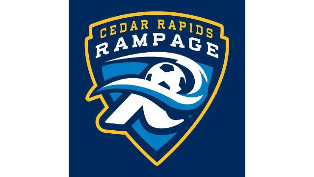
Logo:
Pros - Classic soccer crest, the rampaging rapids over the letter "R", and is it just me, or do those rapids look an awful lot like a backwards "C"? As in "CR"?, the color scheme, the word mark.
Cons - A clear "CR" would be nice, no clear mascot, lacking unique city iconography, a little too like a cop badge.
Grade - Cons might be a little nit-picky (we had to list some) but they mean we can't give an "A". Reaction from us and others (judging by Facebook comments) was very good. Instantly one of the best logos in the MASL (we split on Dallas Sidekicks, Missouri Comets, and Milwaukee Wave logos as our favorites.) A-.
Overall Grade: B+. But names and logos have a way of growing on you. Certainly it could have been worse, we could have been United FC, Sporting, or (shudder) Real. We avoided those...phew!
No comments:
Post a Comment